We often want to understand the relationship between two variables. As a manager you may want to know if sales increase when TV advertisements are run. If yes, by how much? How does higher inflation impact the S&P 500 index? Does higher consumer confidence cause more people to eat out? What each of these questions seeks is the relationship between the two variables in question. It is the relationship between these two variables that will answer each of these questions.
But how do you describe the relationship between two variables? How can you measure the relationship between two variables? Can you quantify or define the relationship between variables? Let’s work with these two variables – TV advertisement spend and Sales. How do you describe the relationship between these two variables? How can you measure the relationship between these two variables?
Measuring the relationship between two variables
The relationship between two variables can be measured in a number of ways. These methods include:
- visual methods (scatter or other graphs)
- two way tables
- correlation
- co-variance
- line fitting (regression analysis)
This article focuses on the line fitting method popularly known as regression analysis. But you must be aware that this is only one method, albeit a very popular one, available to measure the relationship between two variables.
Scatter Graph
A scatter graph is a simple but beautiful method to arrive at the relationship between two  variables. A scatter graph, also called a scatter plot, is a two dimensional graph that plots each data point according to its x and y coordinates (x,y). To the right is a scatter graph with the TV advertisement spend plotted on the x-axis and the sales data plotted on the y-axis. The circled spot is the data point when the advertisement spend of $20 million (on the x-axis) resulted in sales of $812 million (on the y-axis).
What relationship do you notice when we plot the TV advertisement spend and sales data in a scatter graph? Do you see any relationship?
Do you have any data you would like to find the relationship between? Fill in your data in this spreadsheet and run a scatter plot. What do you notice? Do you see any relationship between the variables?
This article focuses on the line fitting method popularly known as regression analysis. But you must be aware that this is only one method, albeit a very popular one, available to measure the relationship between two variables.
Line Fitting 

Line fitting is the process of drawing a line that best describes the relationship between x and y or the variables in question. This line can be drawn in a number of ways. It can be a straight line (linear) or a curved line (curvilinear). Curved lines can be in one of many specific types such as exponential, logarithmic, power, polynomial, etc.
Describing a Straight Line
Remember, in regression analysis your objective is to figure out the relationship between the variables being analyzed. One way to express the relationship between the variables is in the form of a straight line. A straight line can be thought of as a series of dots and can be expressed or described by an equation that is often called a linear equation:
Y = a + bX
In this equation:
- Y is the variable we are trying to predict. It is called the dependent variable because we are assuming that Y is dependent on the X variable (the ‘independent’ variable).
- X is called the independent variable because we assume it is not dependent on Y. It is also called the explanatory variable because it is supposed to “explain” what causes changes in Y.
- b is the slope of the line. The slope reflects how large or small the change in Y will be for a unit change in X.
- a is the intercept or the point at which the straight line will intercept the Y-axis.
A line can be thought of as a series of dots and can be expressed or described as an equation. 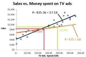 For example the red line can be expressed as an equation: Sales = 675 + 6*TV Adv. Spend. This equation allows you to arrive at the value of each point on this line. It is the series of points that create this line. For example, if we spend $25 on TV advertisements (x = 25) then we can expect sales to hit $825 (its corresponding y coordinate is 825 = 675 + 6*25. And if we spend $38 on TV advertisements (x = 38) then we can expect sales to hit $903 (its corresponding y coordinate is 903 = 675 + 6*38. Similarly, we can account for all the dots that make up the red line using this equation for the red line Y= 675 + 6X or Sales = 675 + 6*TV adv.
This black line can be described by the equation Y= 435.36 + 17.1X or Sales = 435.36 + 17.1*TV Adv. Spend. Which line better fits the data we have represented by the blue dots?
Least Squares Method = Regression Analysis
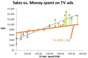
We use the Least Squares method to find the best fitting line or the line with the ‘best fit’. This method calculates the distance between each data point and the closest point on the line. (See vertical bars on the graphs)
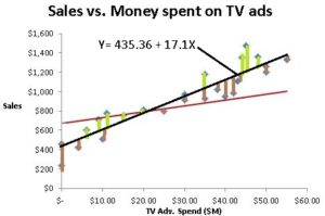 Because some of the dots are above the line and some below the line, we will see some positive numbers (green bars) and some negative numbers (brown bars). We want the best fit or the shortest bars and do not care if the bars are above or below (whether the differences are positive or negative). So we square the distance between each data point and the closest point on the line to eliminate the negative signs and then sum up all the values to get the sum of the squares of the deviations. We choose the line that has the lowest sum of the squares of the deviations as the line with the best fit.
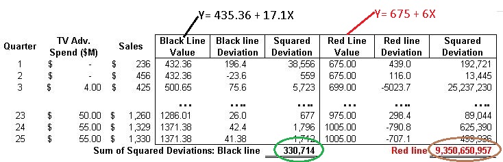
Clearly in the above choices, we see that the black line is a better fitting line than the red line as expressed by the lower sum of squares . We would select the black line over the red line any day.
When we run regression analysis on Microsoft Excel or any other data analysis tool, we are essentially telling the tool to try out many such lines and select the line with the best fit or the one with the lowest sum of squares of deviations.
Assume that we get Microsoft Excel to try out many such lines and conclude that the black line described by the equation Y= 435.36 + 17.1X is the best fit line. What we are concluding is that the relationship between the sales (y variable) and the TV ad spend (x variable) is described by this equation Sales = 435.36 + 17.1*TV Adv. Spend. This equation that describes the best fit line or the relationship between the x and y variables is what we call the regression equation or the regression model.
What is Simple Linear Regression?
Simple linear regression is regression analysis or the analysis of the relationship with two constraints or limitations.
- We consider only two variables at a time. This is the reason for the word simple in the name “simple linear regression”. (This becomes “multiple regression” if we use more than two variables). One variable, placed on the x-axis, is assumed to be an independent variable and the other variable, placed on the y-axis, is assumed to be the dependent variable (i.e., dependent on the x variable).
- We use a straight line or a linear curve when we fit a line to the data scatter plot. The straight line is the reason for the word linear in the name “simple linear”.
This equation that describes the relationship between the x and y variables is what we call the regression equation or the regression model.
Conclusion & Next Steps
Simple linear regression is the analysis of the relationship between variables using the Least Squares Method with two constraints or limitations: 1) only two variables are considered at a time and 2) the relationship is assumed to be a linear relationship.
You understand what simple linear regression is and how the least square method is used to find the best fitting line which forms the simple linear regression equation. Hopefully, you now understand one way to measure and quantify the relationship between two variables.
What next? You can read our article on multiple regression analysis or skip ahead to understand and interpret the output of regression analysis without all the underling statistics. Enjoy learning!
PS: If you are looking for R code to run a simple linear regression, lm(y∼x, data) is all you need. You can define the regression model as a variable to refer to it easily. The R code to run a simple linear regression if we define the regression model as ‘RegMod’ would look as follows:
RegMod <- lm(y∼x, data)
And to get the summary output we will need to run the R code below.
summary(RegMod)
Now that you have the regression output in R, you can learn more about interpreting the regression output here. Enjoy simple linear regression using R!